To create a better picture with room color choices alone, focus on selecting hues that match the mood you want to evoke. Use soft blues or greens for calmness or bright reds and yellows for energy. Consider how lighting affects your colors and choose finishes that enhance the space. Pay attention to details like wall imperfections to guarantee a polished look. Keep experimenting with different shades—if you stay curious, you’ll discover even more ways to transform your space.
Key Takeaways
- Select colors that evoke the desired mood, such as calming blues or energizing reds, to set the right atmosphere.
- Use high-quality paints for vibrant, true colors that remain consistent and long-lasting.
- Test paint samples in different lighting conditions to see how colors appear throughout the day.
- Choose finishes (matte or glossy) that enhance the room’s ambiance and highlight color effects.
- Incorporate color psychology principles to align hues with intended emotional and visual impact.
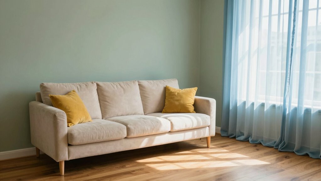
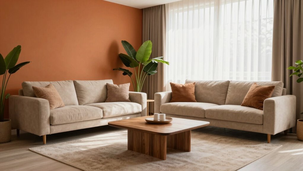
Choosing the right room color can markedly impact the mood and atmosphere of your space. It’s one of the simplest ways to transform a room without any major renovations. When you select your colors thoughtfully, you’re not just picking a shade; you’re setting the tone for how you feel when you’re in that space. Understanding color psychology helps you make choices that align with your desired ambiance. For instance, soft blues and greens promote calmness and relaxation, making them ideal for bedrooms or quiet areas. Bright reds and yellows inject energy and enthusiasm, perfect for lively kitchens or creative zones. By considering the emotional effects of colors, you can craft an environment that naturally supports your activities and mood.
Choosing the right colors sets the mood and transforms your space effortlessly.
However, color psychology isn’t the only factor to keep in mind. The quality of paint you choose plays a crucial role in achieving the desired effect. High-quality paint has better pigmentation, which means richer, more vibrant colors that won’t fade or appear dull over time. It also tends to have a smoother application, resulting in a more polished look. Cheaper paints may seem like a bargain initially, but they often require multiple coats and can chip or discolor faster. Investing in good paint quality ensures your chosen color stays true and enhances the overall aesthetic of your room. Plus, better paints tend to emit fewer odors and contain fewer volatile organic compounds (VOCs), making your space healthier and more comfortable. Additionally, attention to detail is crucial for identifying and addressing imperfections during the painting process, which can significantly affect the final appearance. Incorporating paint quality considerations into your planning can help you achieve a more professional and lasting finish. Furthermore, taking lighting conditions into account can help you visualize how the colors will appear once applied, ensuring your choices look as intended in your specific environment. A thorough understanding of home design principles can also guide you in selecting colors that complement architectural features and room proportions.
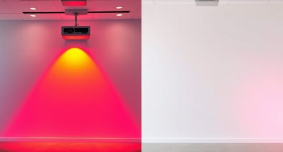
When selecting your room colors, think about the lighting first. Natural light can make colors appear more vibrant, while artificial lighting might dull or alter their hue. Test paint samples in different spots and at different times of day to see how they truly look in your space. Remember, the finish matters too—matte finishes hide imperfections and create a soft, cozy feel, while glossy finishes reflect light and add a lively, modern touch. Combining thoughtful color choices with high-quality paint ensures that your vision comes to life with clarity and durability. Incorporating color psychology into your decision-making can further refine your choices and enhance the emotional impact of your space.
Ultimately, creating a better picture with your room color choices relies on understanding the emotional impact of colors and investing in quality materials. When you pick colors that resonate with your mood and select paint that does justice to those shades, you craft a space that’s both beautiful and functional. Your room becomes more than just a physical environment; it turns into a reflection of your personality, mood, and style—all achieved with the power of color alone.
high quality interior wall paint
As an affiliate, we earn on qualifying purchases.
As an affiliate, we earn on qualifying purchases.
Frequently Asked Questions
How Do Lighting Conditions Affect Room Color Perception?
Lighting conditions considerably impact how you perceive room colors. Natural light brings out warmer or cooler tones depending on the time of day, making colors appear more vibrant or subdued. Artificial lighting, like warm or cool bulbs, can alter the mood and hue of your walls, sometimes making colors look different than in daylight. To get the true color, consider testing your paint under both natural light and artificial lighting before finalizing your choice.
Can Color Choices Influence Mood and Productivity?
Research shows that color psychology can profoundly influence mood and productivity, with blue rooms boosting focus by up to 47%. You can harness this emotional impact by choosing colors that promote calmness, motivation, or creativity. For example, green fosters balance, while yellow energizes. Your room’s color choices directly shape your emotional state, helping you stay productive or relaxed, depending on your goals.
Are Certain Colors Better for Small Versus Large Rooms?
For small rooms, choose light, soothing colors like soft blues or pastels, which can make the space feel larger through color psychology. Larger rooms benefit from deeper, richer hues like navy or emerald, adding warmth and intimacy. Focus on color harmony to create balance and flow, ensuring the colors complement each other and enhance the room’s size perception. Your choice of color impacts mood and spatial feel, so select wisely.
How Do Color Trends Impact Timeless Design Choices?
Color trends ebb and flow like fashion, but timeless design choices anchor your space. You influence this balance by considering color psychology and cultural symbolism, which give your room meaning beyond fleeting trends. While trendy hues might excite, classic colors offer stability and sophistication. You decide whether to embrace current trends or prioritize enduring appeal, ensuring your space remains both stylish and meaningful over time.
What Are Beginner-Friendly Color Combinations for Rooms?
For beginner-friendly room color combos, start with a color wheel to choose harmonious shades. Pair complementary colors, like blue and orange or green and red, for vibrant contrast that’s easy to balance. Soft neutrals with a pop of bold color also work well, making your space inviting yet lively. Keep it simple by sticking to two main colors and adding accents later, creating a stylish, timeless look.
color sample paint tester
As an affiliate, we earn on qualifying purchases.
As an affiliate, we earn on qualifying purchases.
Conclusion
So, next time you’re struggling to capture the perfect shot, remember that your room’s color palette might just be your best asset—though ironically, it’s often overlooked. By choosing the right hues, you can effortlessly enhance your photo’s mood and depth. Sometimes, the simplest trick isn’t about fancy equipment but about the walls around you. After all, who needs filters when your room’s paint colors are already doing all the work?
matte vs glossy paint finish
As an affiliate, we earn on qualifying purchases.
As an affiliate, we earn on qualifying purchases.
VOC free interior paint
As an affiliate, we earn on qualifying purchases.
As an affiliate, we earn on qualifying purchases.