Understanding color science helps you get the most vivid and accurate images from your projector. Focus on the RGB color model, which combines red, green, and blue to create colors, and be aware of your projector’s color gamut for broader, more vibrant tones. Calibrating for the right color temperature and white balance guarantees true colors, while managing brightness and saturation keeps images natural. Learn more about these essentials to optimize your viewing experience and achieve stunning visuals.
Key Takeaways
- Understand the RGB color model, which combines red, green, and blue light to produce a wide range of colors in projectors.
- Recognize that a projector’s color gamut determines its ability to display vivid, true-to-life colors; a broader gamut enhances image quality.
- Proper color calibration and white balance adjustments are essential for accurate color reproduction and optimal viewing experiences.
- Adjust brightness and saturation carefully to maintain natural, vibrant images without over-saturation or dullness.
- Selecting HDR content and optimizing contrast levels can significantly improve color depth, realism, and overall visual immersion.

datacolor SpyderPro Monitor Calibration Tool: Ensures Accurate Color When Viewing and Editing Photos & Videos
ACHIEVE TRUE COLOR – Ensures your monitor displays colors accurately, critical for photography, design, and video editing, with…
As an affiliate, we earn on qualifying purchases.
As an affiliate, we earn on qualifying purchases.
Understanding the RGB Color Model
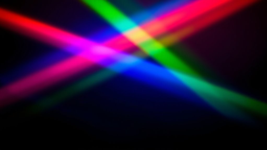
The RGB color model is a system that combines red, green, and blue light to create a wide spectrum of colors. This process relies on color mixing, where varying intensities of each primary color produce different hues. When all three are combined at full strength, they generate white; when none are used, the result is black. Understanding RGB is essential for projectors, as they use light to display images. Unlike the CMYK model, which is used for printing and involves subtractive color mixing, RGB is an additive system. RGB versus CMYK highlights how colors are produced differently depending on the medium. For projectors, mastering RGB helps optimize color accuracy and vibrancy, ensuring your images look vivid and true to life. Additionally, knowing how color temperature adjustments influence the output can further enhance your viewing experience.
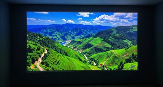
HDR projector with wide color gamut
As an affiliate, we earn on qualifying purchases.
As an affiliate, we earn on qualifying purchases.
The Role of Color Gamut in Projector Performance
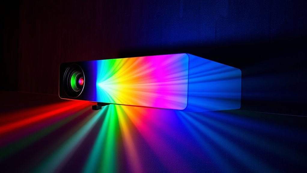
Color gamut defines the range of colors a projector can display, directly impacting the vibrancy and realism of your images. A wider gamut allows more vivid, true-to-life colors, enhancing both color accuracy and color consistency across the screen. When your projector has a broad color gamut, you’ll notice richer reds, vibrant blues, and more detailed greens, making scenes more immersive. Conversely, a limited gamut can cause dull, washed-out images and inconsistent color reproduction. To enjoy maximum performance, look for projectors with a high color gamut that matches or exceeds standard color spaces. This ensures your images stay true to the original content, delivering consistent, accurate colors no matter what you’re viewing. Ultimately, a broader color gamut elevates your viewing experience by providing sharper, more vibrant visuals. Incorporating a wider color gamut into your projector choice can significantly improve overall image quality and viewer satisfaction.
RGB color calibration projector
As an affiliate, we earn on qualifying purchases.
As an affiliate, we earn on qualifying purchases.
How Color Calibration Enhances Image Accuracy
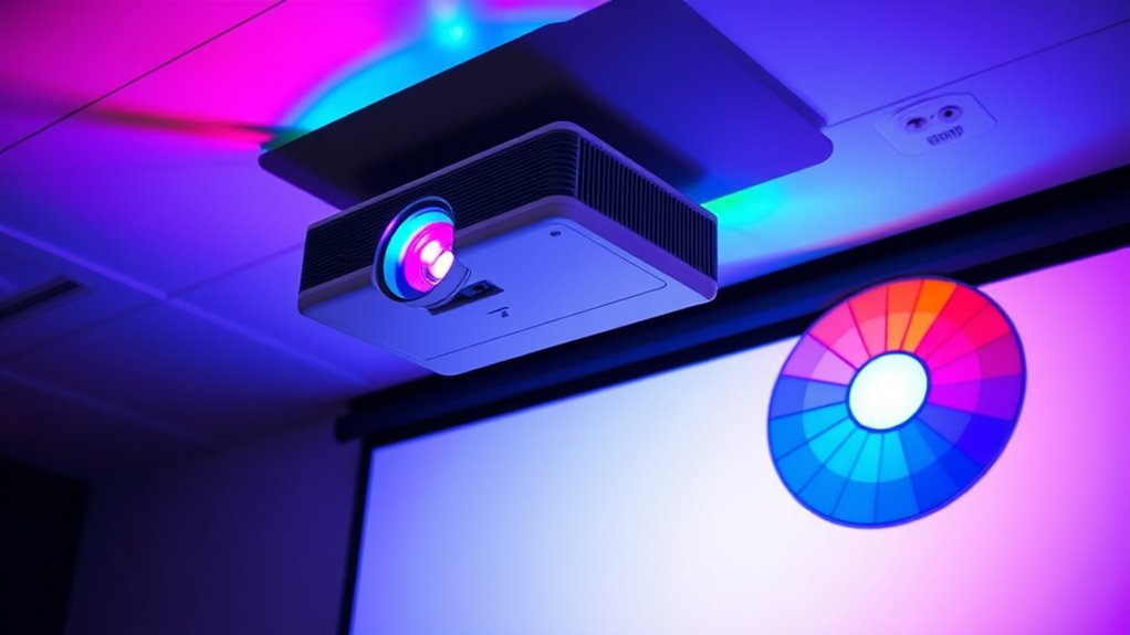
When you calibrate your projector’s colors, you guarantee that the images you see match the creator’s original intent with greater accuracy. Proper calibration fine-tunes color perception, ensuring the hues you view are true to the source material. This not only improves visual clarity but also influences how you interpret images, as color psychology plays a role in emotional response. Accurate colors help you appreciate subtle details and vibrant tones, making movies, games, or presentations more immersive. Without calibration, colors can appear washed out or skewed, leading to misinterpretation of visuals. Additionally, cognitive focus can be enhanced when colors are properly calibrated, reducing eye strain and improving overall viewing comfort. By investing in calibration, you optimize your viewing experience, allowing you to enjoy content as intended, with precise color representation that enhances overall image quality and emotional impact.
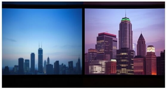
projector white balance adjustment
As an affiliate, we earn on qualifying purchases.
As an affiliate, we earn on qualifying purchases.
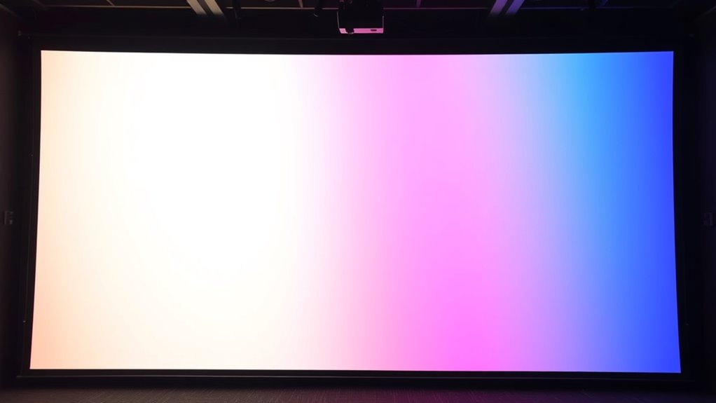
The Significance of Color Temperature and White Balance

- Matching the color temperature to your room’s lighting conditions
- Using white balance controls for precise color correction
- Regularly recalibrating to maintain consistent image quality
- Considering the emotional impact of accurate colors to ensure a comfortable viewing environment which can contribute to emotional support during stressful times.
Differentiating Between Brightness and Color Saturation
Understanding the difference between brightness and color saturation is essential for controlling how your images look. Brightness refers to how light or dark an image appears, directly affecting your perception of overall luminance. In contrast, color saturation impacts color perception by determining how vivid or muted the colors seem. Saturation levels influence the intensity of hues, making images pop or appear more subdued. Increasing brightness doesn’t necessarily enhance color saturation, and vice versa. If you focus solely on brightness, your image might look well-lit but washed out in color. Conversely, adjusting saturation without proper brightness can make colors appear overly intense or unnatural. Balancing these two elements ensures your images have clarity, vibrancy, and a natural appearance, creating a more immersive viewing experience. Proper color management involves understanding how these settings interact to produce realistic and appealing images.
The Impact of Color Depth and Bit Depth on Image Quality

Color depth and bit depth play a vital role in determining the overall quality and realism of your images. Higher color depth allows your projector to display a broader range of colors, making images appear more vibrant and accurate. Bit depth refers to the number of bits used to represent each color, directly affecting how smoothly colors transition and reducing banding. When you increase bit depth, you get:
- Smoother color gradations
- Richer, more detailed images
- Fewer color artifacts and banding issues
Choosing a projector with higher color and bit depth ensures your videos and photos look lifelike and immersive. Understanding these factors helps you appreciate how subtle adjustments can dramatically improve your viewing experience. Essentially, better color depth and bit depth result in images that are more true-to-life and visually engaging. Color accuracy is also enhanced, making your visual content more precise and appealing.
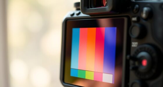
Common Methods for Color Calibration and Adjustment
Calibrating your display guarantees that colors appear accurate and consistent across different devices and environments. To achieve this, you can use common methods like using color calibration tools or software. These tools help you fine-tune your projector’s color matching, ensuring hues are true to the source. Adjusting settings such as brightness, contrast, and color balance promotes better color uniformity across the screen. Professional calibration involves measuring output with a colorimeter or spectrophotometer, then applying precise adjustments. Many projectors also come with built-in calibration options, making quick tweaks accessible. Regular calibration maintains color accuracy over time, preventing shifts caused by aging components or environmental factors. Proper calibration also takes into account suction power and filtration systems to optimize image quality, especially in environments with dust or allergens. This process ensures your images look natural, vibrant, and consistent, enhancing your overall viewing experience.
Recognizing the Importance of HDR and Wide Color Gamut Technologies
HDR (High Dynamic Range) and wide color gamut technologies considerably enhance your viewing experience by delivering more realistic and vibrant images. These advancements improve color perception, making scenes richer and more detailed, which allows you to see subtle differences often missed with standard displays. Recognizing their importance helps you appreciate how these technologies expand your artistic expression, enabling you to create or enjoy visuals that are closer to how humans naturally perceive the world. To maximize these benefits, consider:
- Ensuring your projector supports HDR and a wide color gamut for true color richness
- Calibrating your projector to optimize contrast and color accuracy
- Choosing content specifically mastered in HDR with a broad color spectrum
Incorporating these features elevates your viewing, making every image more immersive and expressive. Additionally, understanding Modern Farmhouse Decor Trends (2024) can inspire design choices that complement your viewing environment and create a cozy, stylish space.
Frequently Asked Questions
How Often Should I Recalibrate My Projector’s Colors?
You should recalibrate your projector’s colors every 6 to 12 months, depending on your usage and environment. Regular color calibration frequency helps maintain ideal picture quality. Incorporate calibration into your projector maintenance schedule, especially if you notice color shifts or image inconsistencies. Environmental changes like lighting or temperature can affect color accuracy, so stay proactive with your calibration routine to ensure vibrant, true-to-life images.
What Common Mistakes Should I Avoid During Color Calibration?
Think of calibration like tuning a musical instrument—you want perfect harmony. Avoid rushing through adjustments; small tweaks matter. Don’t ignore white balance and color temperature, as they set the tone for true colors. Overcorrecting can make images look unnatural, like a painting gone wrong. Always double-check your settings, and remember, patience turns a good calibration into a great one, ensuring vibrant, accurate visuals every time you watch.
Can Ambient Lighting Affect Projector Color Accuracy?
Yes, ambient light can substantially impact your projector’s color accuracy. Too much ambient light, especially in bright or reflective environments, washes out colors and skews your color perception. To maintain accurate colors, you should control ambient lighting by dimming or minimizing it during viewing. Using blackout curtains or adjusting your projector’s brightness settings can help ensure that ambient light doesn’t distort your color perception.
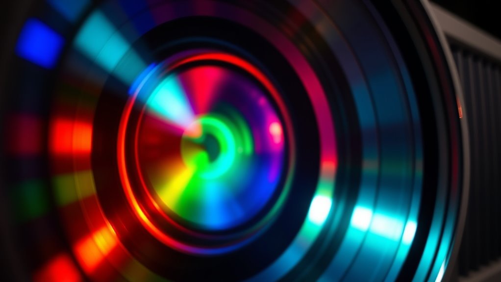
How Does Projector Lens Quality Influence Color Reproduction?
Higher lens quality critically improves your projector’s color reproduction by reducing distortions and ensuring sharper images. A superior lens maintains better light transmission, which enhances color fidelity and contrast. When you invest in a high-quality lens, you’ll notice more accurate, vibrant colors and clearer images, especially in detailed scenes. Poor lenses can cause color distortions and blurriness, so choosing the right lens is essential for achieving true-to-life colors in your projection.
Are There Specific Settings for Different Types of Projection Content?
Yes, adjusting your projector’s settings for different content improves your viewing experience. For movies, set a warmer color temperature to enhance warmth and realism. For vibrant visuals, increase the color gamut to boost color richness and accuracy. Switching between these settings guarantees ideal color reproduction tailored to each type of content, giving you vivid, true-to-life images every time. Make sure to fine-tune these adjustments for the best results.
Conclusion
By grasping these color science basics, you’ll be better equipped to get the most out of your projector. From understanding color models to calibrating for accuracy, every step helps you see the full picture. Don’t let it be a case of missing the forest for the trees—focus on these essentials, and your images will pop like never before. With a little effort, you’ll soon be seeing the world through a more vibrant lens.