
TL;DR

Get business pricing on your home office setup
- Business-only prices and quantity discounts
- Tax-exempt purchasing
- Multiple users, one account, clear invoices
House Beautiful published five designer tips for making rooms feel less uniform without losing cohesion. The suggestions include mixing wood tones, distinguishing a kitchen island, combining dining-chair styles, contrasting artwork and varying hardware finishes.
House Beautiful has published five designer tips for adding variety to rooms that feel overly coordinated, including mixing wood tones, choosing a distinct look for a kitchen island, and pairing different dining chairs. The advice offers homeowners ways to add character and visual contrast while keeping a room feeling connected rather than chaotic.
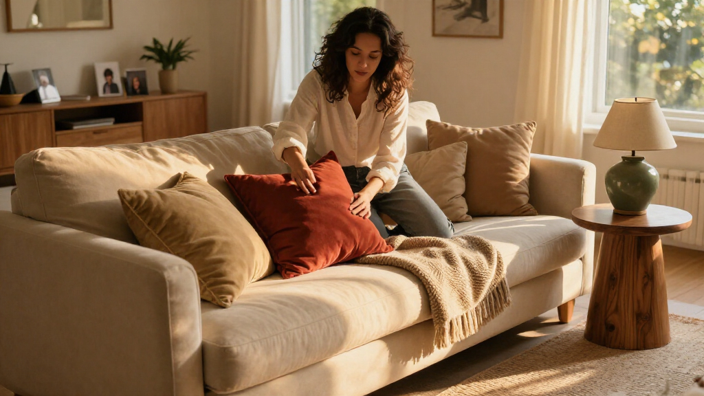
The report’s central point is that a room does not need to use matching furniture, finishes or artwork throughout to look considered. Designer Preeti Shah, founder and principal designer at Spotlight Style, says a space can look sterile when everything comes from the same set. The article presents contrast as a way to make a home feel more personal, while using repeated details to retain cohesion.
For wood, Leah Hook, founder and principal designer at Gray Oak Studio, recommends combining light and dark tones rather than repeating one finish on every surface. A wood tone can recur in a smaller object, such as an art frame or tray, to connect pieces that otherwise differ. For kitchens, Gaelle Dudley, founder and creative director at GLDESIGN, suggests giving an island a more distinctive stone or a thicker edge than the surrounding counters.
The other ideas address dining rooms, art and fixtures. Pattie Kelly, certified interior decorator and owner of Inspired Home Interiors, advises choosing one feature to repeat among dining chairs while sourcing chairs from different collections. The article also recommends combining contrasting art styles and frame materials, with a shared detail such as mat size helping the display feel curated. Finally, it suggests mixing finishes, such as brass and matte black, rather than repeating one shiny finish everywhere.
How Contrast Can Personalize a Room
The advice matters to readers making decorating decisions because coordinated sets can be convenient, but they may also leave little room for individual choices. The article offers specific, relatively contained ways to change a room without replacing every item: a contrasting chair, a different frame, or a small repeated wood accent can shift the overall impression.
Its suggestions also distinguish variety from randomness. Repeating a limited element—such as a tone, chair feature or frame dimension—can link pieces that do not match exactly. That gives homeowners a practical design principle: introduce contrast, then use a detail to connect it. The guidance is aesthetic, however, and does not establish that these changes will raise a home’s value or suit every room.
Products Worth Considering

Bose SoundLink Plus Portable Bluetooth Speaker, Black

Levoit Core 600S-P Smart Air Purifier for Large Rooms

Blueair Blue Pure 211i Max Air Purifier for Large Rooms
As an affiliate, we earn on qualifying purchases.
Five Ways to Loosen a Matching Set
The House Beautiful report focuses on interiors that may have started with coordinated furniture or finishes, particularly bedrooms with matching nightstands and lamps. It does not argue that matching items are always a problem; its premise is that extending one look across every surface can make a home feel less expressive. The designers’ examples show ways to interrupt that uniformity without abandoning a cohesive scheme.
The five approaches cover different levels of a room: materials (mixed wood tones), a kitchen’s central feature (a distinct island), furniture (varied dining chairs), wall decor (contrasting art and frames), and smaller fittings (mixed hardware finishes). In several examples, the report pairs contrast with a unifying feature, such as repeating a wood tone or keeping mat sizes consistent.
“A home often looks sterile when everything comes from the same set.”
— Preeti Shah, founder and principal designer at Spotlight Style
What the Design Advice Cannot Establish
The report offers professional opinions and illustrated examples, not a controlled comparison of decorating approaches. It does not establish that mixed finishes or furniture will work in every home, or that they will make a room feel more expensive to all viewers. Those outcomes depend on the room, materials, proportions and personal preference.
The source also gives no publication date, pricing, project budgets or product specifications beyond the island-edge examples. It does not assess installation requirements for stonework or hardware. Readers considering renovation work would need to check dimensions, costs and any relevant professional or building requirements for their project.
Applying the Ideas at Home
The report does not announce a follow-up or identify a next scheduled development. Its practical next step for readers is to assess one room and choose a single area to vary, rather than replacing everything at once. A homeowner could, for example, add one contrasting chair or frame, then repeat a small color or material detail elsewhere to keep the change connected to the room.
For larger changes, such as replacing an island surface, readers would need to confirm measurements, materials, installation costs and project requirements before proceeding. The article provides design suggestions, but it does not supply project-specific plans or estimates.
Key Questions
What are the five ways to make a room less matchy?
House Beautiful recommends mixing wood tones, giving a kitchen island a distinct look, combining dining-chair styles, contrasting artwork and varying fixture finishes.
How can different pieces still look coordinated?
The designers suggest repeating a limited detail, such as a wood tone in a tray or frame, or keeping mat sizes consistent across varied artwork. That can provide a visual link without requiring exact matches.
What should I check when mixing dining chairs?
The article advises considering chair height and the space needed to pull each chair out. It also recommends repeating one element across the chairs so the combination feels intentional.
Does the article show that mixed finishes make a home more valuable?
No. The report presents designers’ aesthetic advice and examples; it does not provide evidence that the approach increases property value or produces the same result in every home.
Source: housebeautiful.com