TL;DR

Get business pricing on your home office setup
- Business-only prices and quantity discounts
- Tax-exempt purchasing
- Multiple users, one account, clear invoices
A Veranda report gathers designers’ recommendations for pairing chocolate brown with seven colors: jewel tones, dusty pink, off-white, camel and other warm neutrals, butter yellow, crimson and chartreuse. Designers say warm or contrasting shades can balance brown’s depth, while cool grays and some very dark purples may compete or make a room feel dull.
Veranda has published a designer-led guide to seven colors that pair with chocolate brown in home interiors, including jewel tones, dusty pink, off-white, camel, butter yellow, crimson and chartreuse. The report’s recommendations offer readers practical ways to balance the deep, warm shade, with designers advising against some cool neutrals and very dark purples.
The report draws on comments from designers and paint-industry specialist Ruth Mottershead, creative director at Little Greene. Mottershead says brown has gained favor alongside a broader interest in warm, earthy colors. The article describes chocolate brown as a shade that can bring contrast to pale colors and warmth to richer palettes, and suggests using it through paint, textiles or dark wood furniture.
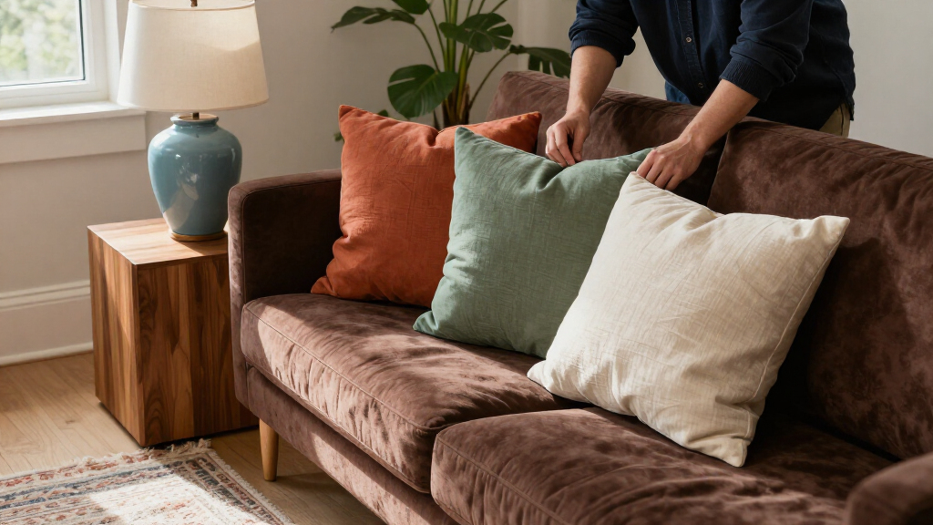
For a saturated scheme, Georgia-based designer Grace Brackman recommends pairing brown with emerald, citrine and sapphire, among other jewel tones. She favors velvet for a chocolate-brown sofa, saying the fabric’s sheen can make the color look richer. Birmingham, Alabama-based designer Sarah Moore cautions that some dark amethysts and aubergines may sit too close to brown in tone and compete with it.
Moore also recommends dusty pink, saying its lightness can offset brown’s moodier quality. For a lighter contrast, Mottershead favors warm off-whites, stone shades or warm grays over stark white. Atlanta-based designer Liz Williams says camel is a more effective neutral partner than cool gray, which she believes can leave brown looking dull.
Choosing a Balance for Brown
The guide addresses a practical decorating choice: chocolate brown can anchor a room, but its depth can dominate if every nearby color is equally dark or muted. The designers’ suggestions point to two broad approaches—use lighter shades such as dusty pink and warm off-white to soften the contrast, or choose saturated colors to create a more dramatic palette.
The advice also distinguishes between neutrals that may look similar on a color chart but behave differently in a room. Warm camel and off-white are presented as companions to brown, while cool gray and stark white are described as less harmonious. These are design opinions, not universal rules; room lighting, materials and individual preference can affect how a palette appears.
As an affiliate, we earn on qualifying purchases.
Why Designers Favor Warm Brown
The report places chocolate brown within a renewed interest in earthy, nature-linked colors. Mottershead says brown was once dismissed as dated or dull, but that designers and consumers have increasingly embraced warm tones, including deep chocolate alongside caramel and honey shades. The source offers this as her account of the color trend, rather than as measured market data.
Chocolate brown can enter a room in several ways, from painted walls or baseboards to upholstery and wood furniture. The article’s seven pairings are jewel tones, dusty pink, off-whites, camel and other warm neutrals, butter yellow, crimson, and chartreuse. For crimson, Moore recommends adding warm cream as a visual break between the two strong colors. The supplied source text begins its chartreuse section but cuts off before giving the designer’s full guidance.
“For a long time, brown was dismissed as dated or dull, but in recent years we’ve seen a clear movement towards warm, earthy colors that help us feel connected to the natural environment.”
— Ruth Mottershead, creative director at Little Greene
As an affiliate, we earn on qualifying purchases.
Where the Palette Advice Ends
The recommendations are designers’ judgments, not controlled comparisons or guarantees that a palette will work in every home. The source does not provide testing, consumer data or a method for ranking the seven pairings. Lighting, finishes, room size and the exact undertones of paint and fabric are not assessed in the supplied material.
The source text provided for the chartreuse section is incomplete, ending before the full explanation of how designers suggest pairing it with chocolate brown. It also does not identify which shades should be avoided beyond examples involving cool gray, stark white and some dark purples.
As an affiliate, we earn on qualifying purchases.
Testing These Colors at Home
The report does not announce a follow-up or a scheduled next development. Readers considering the combinations can use the article’s suggestions as a starting point, then compare paint and fabric samples in their own rooms, where daylight and artificial lighting can change how colors appear. The source does not specify particular products, paint codes or exact color values.
As an affiliate, we earn on qualifying purchases.
Key Questions
Which colors does the report recommend with chocolate brown?
The seven listed options are jewel tones, dusty pink, off-whites, camel and other warm neutrals, butter yellow, crimson and chartreuse.
Which neutrals do the designers prefer?
The designers favor warm off-whites, natural stone shades and camel. The report cautions that stark white can create a sharp contrast and cool gray may make brown look dull.
Can chocolate brown work with jewel tones?
Yes. Grace Brackman recommends pairing brown with shades such as emerald, citrine and sapphire. Sarah Moore cautions against some very dark purples that may compete because they are close to brown in tone.
How does dusty pink work with chocolate brown?
Sarah Moore says dusty pink’s softness and lightness can balance brown’s moodier appearance. The source suggests combinations such as a brown rug with a blush sofa or pink floral textiles alongside brown walls.
Does the report give a complete chartreuse recommendation?
No. The supplied source text cuts off during the chartreuse section, so its full explanation and recommendation are not available.
Source: rss
Fall Picks
fall essentials
As an affiliate, we earn on qualifying purchases.