To fine-tune saturation and hue for the best results, start by understanding how each affects your image—saturation boosts color intensity, while hue shifts shades. Use adjustment layers for precise, non-destructive edits, targeting specific areas when needed. Keep your tweaks subtle to maintain natural-looking colors and avoid overdoing it, which can distort the message. If you want to learn more about subtle yet effective adjustments, continue exploring proven techniques and principles.
Key Takeaways
- Use adjustment layers for non-destructive, precise control over hue and saturation changes.
- Make subtle tweaks to enhance natural colors without oversaturation or distortion.
- Focus on key elements; target specific colors or areas for more effective fine-tuning.
- Always compare edited versions side-by-side with the original to maintain authenticity.
- Consider color psychology to align adjustments with desired emotional impact and mood.
Understanding the Basics of Saturation and Hue

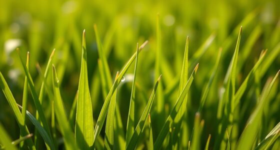
Understanding the basics of saturation and hue is essential for effectively adjusting and enhancing colors in images. Your knowledge begins with the color wheel, a visual tool that shows how colors relate and interact. Hue refers to the specific shade, like red or blue, while saturation determines the intensity or vividness of that color. When you adjust hue, you shift the color along the wheel, changing its appearance. Saturation affects how bold or muted the color appears. Recognizing the impact of these adjustments connects to color psychology, as different colors evoke specific emotions and moods. Mastering these fundamentals allows you to craft visually appealing images that communicate your intended message clearly and powerfully, especially when considering how color relationships influence overall harmony.
Using Adjustment Layers for Precise Color Control

Using adjustment layers allows you to make precise color changes without permanently altering your image. You can target specific colors or areas for fine-tuned control, ensuring your edits are both accurate and flexible. This non-destructive approach helps you experiment confidently while maintaining the original image quality. Additionally, understanding color correction techniques can help you achieve more reliable and consistent results.
Non-destructive Editing Techniques
Non-destructive editing techniques, such as using adjustment layers, give you precise control over color adjustments without permanently altering your original image. This approach allows you to experiment with color grading and tonal balance while maintaining the flexibility to revert or refine changes. Adjustment layers enable you to tweak saturation, hue, and brightness selectively, ensuring you can fine-tune specific areas without affecting the entire image. By stacking multiple adjustment layers, you can create complex color effects or correct subtle tonal issues without compromising image quality. This method preserves your original file, making it easier to compare before-and-after states or make future modifications. Additionally, understanding tuning options for vehicles can inspire creative color grading in your editing projects. Overall, non-destructive editing empowers you to achieve professional results with maximum control and minimal risk of irreversible mistakes.
Targeted Color Adjustments
Targeted color adjustments allow you to refine specific hues or areas within an image without altering the entire composition. Using adjustment layers, you can isolate parts of your image and tweak their colors based on color theory principles. This precise control helps you enhance visual harmony and evoke desired emotions through color psychology. For example, adjusting the saturation of warm tones can generate feelings of warmth or energy, while cooling down certain hues can create calmness. Additionally, understanding color psychology can guide your adjustments to better convey the intended mood. By applying these adjustments selectively, you prevent unwanted shifts in other parts of the image. This method guarantees your edits are intentional and impactful, giving you the ability to fine-tune color relationships and mood. Overall, targeted adjustments empower you to craft more compelling and emotionally resonant visuals.
Identifying When to Increase or Decrease Saturation
Knowing when to increase or decrease saturation hinges on recognizing the visual cues in your image. Bright, vibrant areas may benefit from reduced saturation to avoid overwhelming viewers, while dull sections might need a boost to enhance appeal. Use color psychology to interpret emotional responses: overly saturated reds can evoke excitement, but too much can feel aggressive, whereas muted blues may convey calmness but risk appearing dull. Consider this visual guide:
| Saturation Level | Visual Cue | Effect on Viewer |
|---|---|---|
| Too high | Colors appear unnatural or overwhelming | Causes discomfort, emotional overload |
| Optimal | Colors are vivid but balanced | Engages viewers effectively |
| Too low | Colors look washed-out or dull | Diminishes impact, feels bland |
Adjust saturation based on these cues, ensuring your images evoke the desired emotional response through saturation psychology. Additionally, understanding color saturation helps in making precise adjustments that resonate with your target audience.
Techniques for Correcting Color Inaccuracies

Accurate color reproduction is essential for creating visually appealing images, but color inaccuracies often occur due to lighting conditions, camera settings, or device calibration issues. To correct these, apply principles from color theory, such as adjusting hues to align with natural tones or desired color schemes. Use color harmony techniques to balance hues, making corrections appear more natural and pleasing. Start by analyzing the color wheel to identify mismatched or off-tone colors. Then, fine-tune hue and saturation selectively, ensuring colors complement each other and maintain consistency. Utilizing tools like histograms or color pickers can help pinpoint inaccuracies. Understanding color relationships within the spectrum can help you restore harmony and authenticity, resulting in images that look true to life and visually cohesive.
Creating Mood and Atmosphere Through Color Tweaks

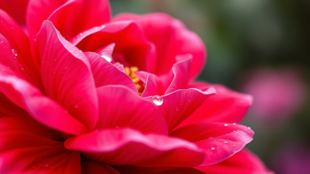
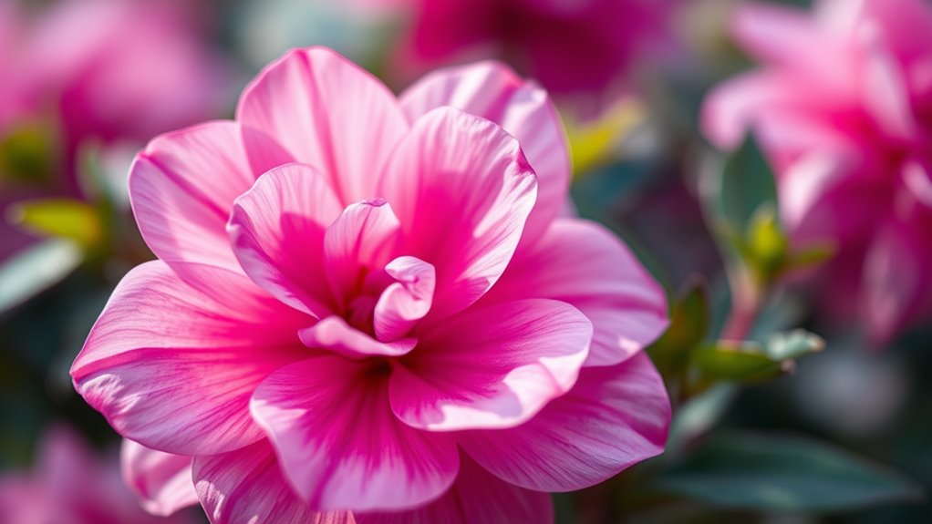
Color tweaks are a powerful way to evoke specific moods and shape the atmosphere of your images. By adjusting saturation and hue, you tap into color psychology to influence viewers’ emotional impact. Warm tones like reds and oranges can create feelings of energy, passion, or warmth, while cool tones such as blues and greens evoke calmness, serenity, or melancholy. Subtle hue shifts can make a scene feel more nostalgic or surreal, depending on your intent. Saturation adjustments can intensify emotions or soften the scene for a more muted, subdued effect. Carefully tweaking these elements allows you to craft an atmosphere that aligns with your story or message. Remember, small changes often have a big impact on the emotional tone conveyed through your imagery. For digital artists and videographers, understanding color psychology is essential for creating compelling visual narratives.
Tips for Maintaining Natural-Looking Colors
To keep your colors looking natural, you need to balance vibrancy carefully so images don’t become oversaturated. Small, subtle adjustments often make the biggest difference and help maintain realistic tones. Remember, less is more when it comes to creating a believable, polished look. Additionally, understanding color harmony principles can guide you in achieving more cohesive and natural color adjustments.
Balance Vibrancy Carefully
Adjusting vibrancy can instantly boost a photo’s appeal, but it’s easy to go overboard and end up with unnatural-looking colors. To maintain a natural look, focus on balancing vibrancy carefully to support color harmony rather than overpowering it. Over-saturating can create a jarring visual impact that distracts viewers and undermines the photo’s authenticity. Instead, aim for subtle enhancements that highlight key elements without sacrificing realism. Keep an eye on how colors interact, ensuring they complement each other naturally. Small adjustments often produce the most pleasing results, helping your image stay vibrant without feeling artificial. By being mindful of vibrancy levels, you preserve the photo’s true essence, making sure the colors enhance rather than detract from its overall harmony. Incorporating color harmony principles can further guide your editing process to achieve balanced and visually appealing results.
Use Subtle Adjustments
Even small tweaks can make a big difference in maintaining natural-looking colors. When adjusting saturation and hue, aim for subtle changes that respect color psychology, ensuring your visuals evoke the intended emotions. Overdoing adjustments can distort the message, especially considering cultural implications where color meanings vary widely. For instance, a slight shift toward softer tones can create a more harmonious feel, avoiding exaggerated or unnatural results. Always compare your edits side-by-side with the original to keep the look authentic. Remember, less is often more—small, carefully considered modifications help preserve the integrity of your images while ensuring they look natural and appealing. Additionally, understanding the impact of color psychology can guide you in making effective adjustments that resonate positively with your audience. This approach not only enhances visual realism but also maintains the audience’s trust and emotional connection.
Frequently Asked Questions
How Do Different Lighting Conditions Affect Saturation and Hue Adjustments?
Lighting variability and sensor sensitivity markedly impact how you should adjust saturation and hue. In bright or uneven lighting, colors may appear washed out or overly saturated, so you need to tweak these settings carefully. Low light can cause colors to look dull, requiring you to boost saturation slightly. Sensor sensitivity influences color accuracy; higher sensitivity might distort hue, so make small adjustments to achieve natural, consistent results across different lighting conditions.
Can Saturation and Hue Adjustments Impact the Overall Image Quality?
Yes, saturation and hue adjustments can impact overall image quality, especially if not carefully managed. They can affect color consistency across your editing workflows, making images look unnatural or unbalanced. You need to fine-tune these settings to preserve natural tones and guarantee smooth transitions. Proper adjustments enhance visual appeal without degrading quality, helping you achieve a cohesive, professional look in your final images.
Are There Specific Color Combinations to Avoid When Fine-Tuning Saturation?
Yes, you should avoid certain color combinations to prevent color clash and unwanted hues. Bright reds with greens, oranges with blues, or yellows with purples often create harsh contrasts that distract from your image. Steer clear of oversaturating these pairs, as they can make your photo look unnatural. Instead, aim for complementary or analogous colors, which blend harmoniously and enhance your overall image quality.
How Do Monitor Calibration Issues Influence Color Editing Accuracy?
Monitor calibration issues can considerably impact your color editing accuracy because they affect how your display reproduces the color gamut. If your monitor isn’t properly calibrated with reliable calibration tools, colors may appear inaccurate or inconsistent, leading to flawed adjustments. Regular calibration ensures your monitor accurately displays colors within its gamut, allowing you to make precise edits and achieve consistent, professional results.
What Are Advanced Techniques for Subtle Color Grading Enhancements?
Did you know that subtle color grading can improve visual impact by up to 30%? You can achieve this by using advanced techniques like adjusting color contrast and applying gradient mapping. These methods allow you to refine tones delicately, creating seamless progressions and enhanced depth. By experimenting with these tools, you subtly enhance your footage, making it more compelling while maintaining a natural look.
Conclusion
By fine-tuning saturation and hue, you transform dull images into vibrant scenes, much like adding a splash of color to a grayscale sketch. When you adjust carefully, your photos become lively and natural, avoiding the harshness of oversaturation. Think of color corrections as balancing a palette—too much or too little can distort the scene’s mood. Master these tweaks, and you’ll create images that are both striking and authentic, capturing the true essence of your shot.