Exploring color temperature presets helps you quickly set the mood and tone of your photos or videos. Use warm presets for cozy, inviting scenes or golden hour shots that evoke comfort and nostalgia. Cool presets create a modern, calm vibe perfect for urban or nature scenes. Neutral presets offer balanced, natural looks suitable for most situations. If you want to master these tools and make your visuals stand out, there’s more to uncover as you continue.
Key Takeaways
- Color temperature presets quickly adjust images to match lighting conditions, creating desired moods and visual harmony.
- Warm presets enhance cozy, intimate scenes, ideal for indoor or sunset shots.
- Cool presets evoke calm, modern, and sleek atmospheres, suitable for urban or natural environments.
- Neutral presets maintain authentic colors, perfect for accurate representation across various lighting scenarios.
- Combining or customizing presets allows for personalized styles and emotional storytelling in your images.
Understanding Color Temperature and Its Role in Photography
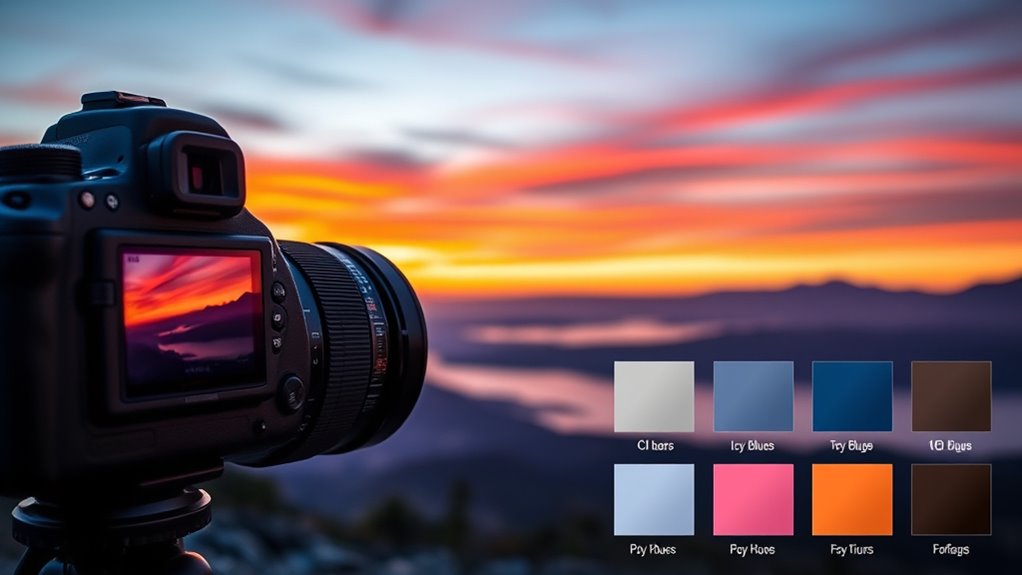
Understanding color temperature is essential because it influences how your photos look and feel. The concept links closely to color temperature psychology, which explains how different hues evoke specific emotions. Warm tones, like oranges and reds, tend to create cozy, inviting scenes, while cooler tones like blues convey calmness or detachment. Historically, lighting techniques relied on natural light sources and candlelight, which had distinct color temperatures shaping artistic choices. Recognizing these influences helps you see how lighting impacts mood and perception. By understanding how color temperature affects visual storytelling, you can better control the atmosphere in your photos. Whether mimicking historical lighting styles or choosing modern settings, mastering this fundamental aspect ensures your images communicate exactly what you intend. Additionally, being aware of color temperature presets can streamline your editing process and enhance consistency across your images.
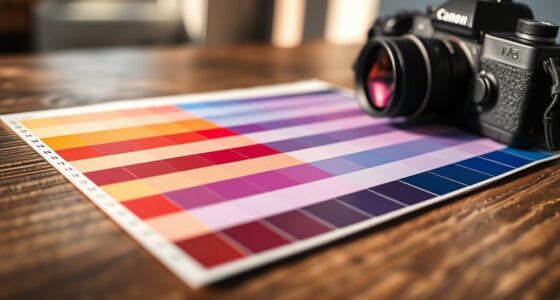
The Basics of Color Temperature Presets
Color temperature presets are handy tools that help you quickly adjust your camera settings to match different lighting conditions. They simplify the process of achieving color harmony in your photos, ensuring that the colors look natural or evoke the desired mood. By selecting a preset, you can match the light source’s warmth or coolness, which impacts how viewers perceive your image through color psychology. For instance, warmer presets create inviting, cozy atmospheres, while cooler presets can evoke calmness or professionalism. Understanding these presets allows you to control the overall tone and emotional impact of your shots effortlessly. They serve as a practical starting point, helping you maintain consistency and clarity in your images, regardless of varying lighting environments. Additionally, quotes about fatherhood can inspire a sense of guidance and support within your creative process.
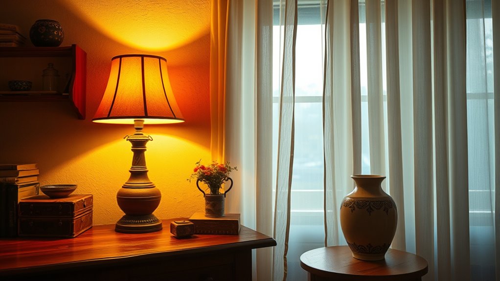
Warm Presets: Creating Cozy and Inviting Atmospheres

Warm presets are a powerful way to instantly create a cozy and inviting atmosphere in your photos. They enhance skin tones and add a gentle glow that feels welcoming. Using film simulation presets can amplify this effect, mimicking classic film stocks that emphasize warm hues. When applying color grading techniques, you can fine-tune the warmth to evoke feelings of comfort or nostalgia. These presets are ideal for capturing intimate moments, interior shots, or outdoor scenes during golden hour. By intentionally choosing warm presets, you guide viewers to experience your images as friendly and approachable. Remember, subtle adjustments can deepen the cozy feeling, making your photos resonate with warmth and emotional appeal, perfect for storytelling or creating a sense of connection. Incorporating color temperature adjustments can further enhance the mood and ensure the warmth aligns with your creative vision.
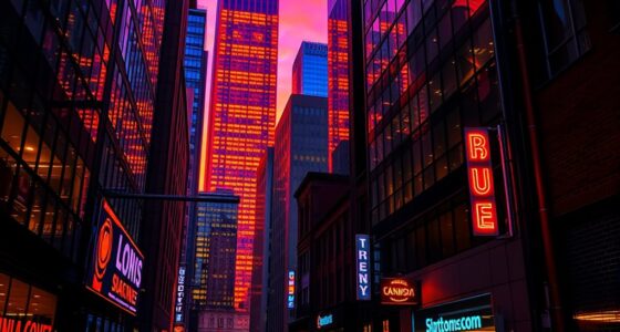
Cool Presets: Enhancing Calmness and Modern Vibes
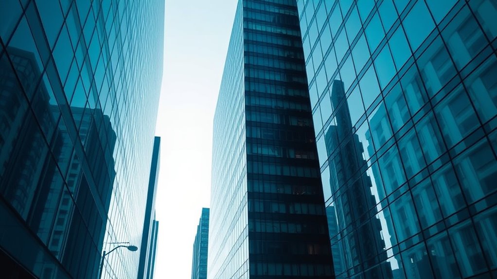
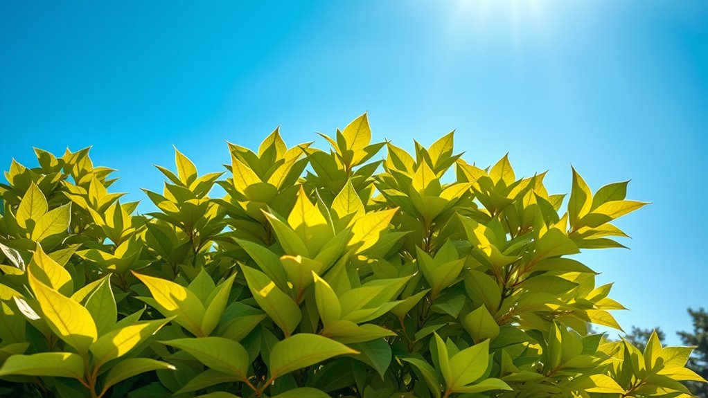
Cool presets are an excellent choice when you want to evoke a sense of calmness and bring a modern, sleek vibe to your photos. In color psychology, cool tones like blues and greens are associated with tranquility, clarity, and professionalism. Historically, these colors have been linked to technological innovation and minimalism, reflecting contemporary design trends. Using cool presets can enhance the mood of your images, making them feel more serene and sophisticated. They work well in urban settings, nature scenes, or any context where you want to emphasize freshness and clarity. By aligning with current color trends, cool presets help your photos convey a sense of modernity and calm, resonating with viewers who appreciate clean, crisp aesthetics. Additionally, understanding the scope of ethical hacking can help photographers better protect their digital images from unauthorized access or misuse.
Neutral Presets: Achieving Balanced and Natural Looks
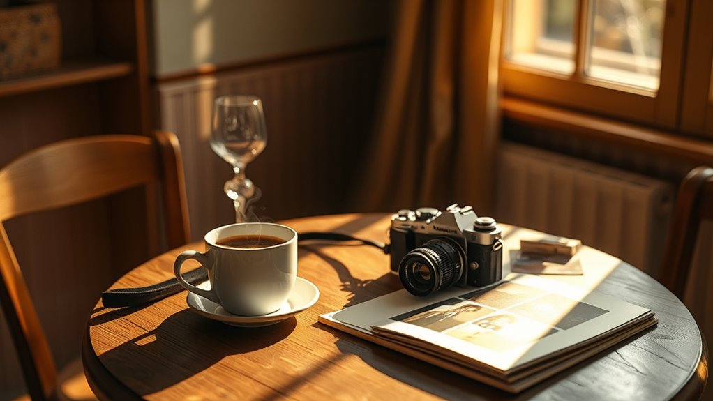
Neutral presets provide natural color rendering that accurately reflects your scene without adding warmth or coolness. They’re versatile and work well across different lighting conditions, making them ideal for various shooting situations. Using these presets helps you achieve a balanced, authentic look every time. Additionally, understanding color accuracy ensures your images remain true to life and consistent across different devices.
Natural Color Rendering
Achieving a natural and balanced look in your photos often involves using neutral presets that accurately reproduce colors as your eyes see them. Natural color rendering emphasizes color accuracy, ensuring that each hue appears true to life. These presets help maintain consistent skin tones, preventing unnatural shifts that can distract viewers. When you choose a neutral preset, you’re prioritizing authenticity over dramatic effects, making your images more relatable and true to the scene. This approach is especially useful in portrait photography or scenes where true-to-life colors matter most. By focusing on natural color rendering, you allow the genuine essence of your subject to shine through without manipulation, creating photos that feel genuine, balanced, and visually pleasing. Additionally, understanding color temperature presets can help you fine-tune your images to better match ambient lighting conditions.
Versatile for Scenes
Because neutral presets are highly adaptable, they serve as a reliable foundation for a wide range of scenes. They help you maintain color harmony and guarantee visual consistency, regardless of lighting conditions. These presets are ideal when you want a balanced, natural look that complements different environments. Using neutral presets, you can:
- Create a calm, inviting atmosphere that feels genuine
- Adapt seamlessly to varying lighting without disturbing color harmony
- Enhance skin tones and natural textures for authentic visuals
- Keep your footage versatile, allowing easy adjustments for different scenes
- Incorporate natural materials effectively to emphasize authenticity and warmth in your visuals
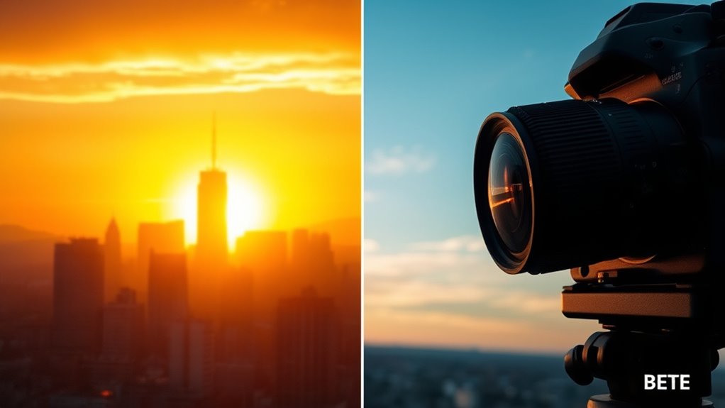
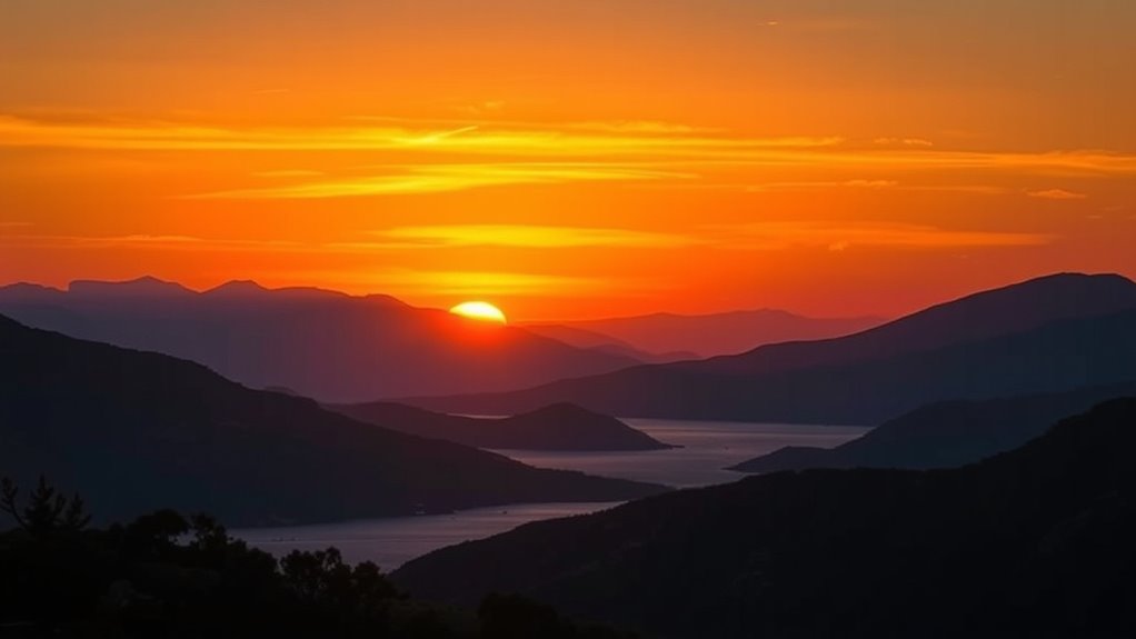
When to Use Daylight and Sunny Presets for Outdoor Shots
Sunny and daylight presets are ideal for outdoor shots when the sky is clear and bright. These presets enhance the natural light, making colors appear vibrant and true to life. Use them during the golden hour, just after sunrise or before sunset, to capture warm, soft tones that add depth and emotion to your photos. They help maintain color harmony, ensuring skin tones and landscape hues blend seamlessly. When shooting in full sun, daylight presets can reduce harsh shadows and glare, giving your images a balanced look. These presets are perfect for capturing the essence of outdoor scenes, emphasizing the clarity and brightness that make outdoor photography so compelling. Apply them when you want your photos to look natural, lively, and full of energy. Additionally, understanding color temperature presets can further optimize your editing process by matching the light conditions accurately.
Using Tungsten and Incandescent Presets for Indoor Lighting

Indoor lighting often casts warm, yellowish tones that can alter the true colors of your photos. Using tungsten and incandescent presets helps you embrace this warmth, ideal for creating cozy atmospheres in interior design or setting a nostalgic mood in film production. These presets mimic the glow of traditional bulbs, making spaces feel inviting and intimate. Consider these emotional impacts:
- Enhance the sense of comfort and familiarity.
- Highlight rich textures and deep hues.
- Evoke feelings of nostalgia or romance.
- Create a visually cohesive environment that complements your style.
Creative Applications of Color Temperature Adjustments

Creative color temperature adjustments open up a world of artistic possibilities, allowing you to craft moods and narratives that resonate with your audience. By using lighting techniques and color grading, you can evoke emotions, highlight themes, or create visual contrast. Warm tones may convey intimacy or nostalgia, while cooler tones evoke calm or detachment. Experimenting with presets lets you quickly set the mood and refine your storytelling. To help you visualize, here’s a helpful guide:
| Mood | Lighting Technique | Color Grading Effect |
|---|---|---|
| Cozy & Warm | Soft tungsten lights | Enhances warmth |
| Cool & Clinical | Fluorescent or LED lights | Adds detachment |
| Dreamy & Surreal | Diffused lighting | Creates softness |
| Intense & Dramatic | Hard shadows | Boosts contrast |
Using color temperature presets can streamline your workflow and ensure consistency across your projects. Use these tools to elevate your creative projects.
Combining Presets for Unique Visual Effects

You can create striking visuals by layering different presets to add depth and complexity. Blending presets thoughtfully helps set the perfect mood and enhances emotional impact. Feel free to customize effects to make your images truly stand out. Incorporating dynamic communication exercises can also inspire more expressive and engaging visual storytelling, fostering a deeper connection with your audience.
Layering Presets Creatively
By layering different color temperature presets, you can craft striking visual effects that stand out. Creative layering allows you to blend presets in ways that evoke strong emotions and highlight unique aspects of your images. Experiment with preset blending to combine warm and cool tones, creating dynamic contrasts or subtle atmospheres. Here are some ideas for impactful preset layering:
- Mix warm and cool presets to evoke nostalgia or serenity.
- Overlay a soft preset on a vibrant one to add depth and complexity.
- Use contrasting presets to create tension or drama.
- Combine subtle variations for a cohesive, artistic look.
These techniques help you access new visual possibilities, making your images more compelling and memorable through thoughtful preset blending.
Blending for Mood
Blending different color temperature presets can dramatically influence the mood of your images, transforming a simple shot into an evocative piece of art. By carefully combining warm and cool tones, you create striking color harmony that guides viewers’ emotions. For example, overlaying a warm sunset preset with a cooler ambient tone can evoke feelings of nostalgia or tranquility. This merging heightens the emotional impact, making your visuals more compelling. Experiment with subtle transitions or bold contrasts to achieve the desired atmosphere. Remember, the goal is to enhance the story you want to tell through your image. Thoughtful blending allows you to craft a unique visual effect that resonates emotionally, giving your photos a distinct personality and mood.
Customizing Effects
Building on the idea of blending for mood, customizing effects involves mixing multiple presets to craft truly unique visuals. With color grading, preset customization allows you to fine-tune each shot, creating specific emotional responses. By combining different effects, you can evoke feelings of nostalgia, excitement, or calmness. Consider these approaches:
- Layer warm and cool presets to create contrast and depth.
- Adjust saturation and contrast for a more dramatic or subtle impact.
- Use color overlays to emphasize particular tones or moods.
- Save your custom combinations for consistent branding or storytelling.
Experimenting with preset customization helps you develop a signature style and makes your visuals more compelling. This tailored approach guarantees your work resonates emotionally, elevating your creative storytelling.
Tips for Customizing and Saving Your Favorite Presets
To make the most of your lighting setup, tailoring and saving your favorite color temperature presets guarantees quick access to your preferred settings. Start by organizing your presets for easy retrieval—use clear labels and categorize them by scene or mood. Consistent presets organization prevents confusion and saves time during setup. When customizing, tweak the temperature until it perfectly matches your desired ambiance, then save it with a descriptive name. Sharing presets with colleagues or collaborators is simple—export them and send via file or cloud service. This enables consistent lighting across projects and eases collaboration. Always review your saved presets periodically to refine or update them, ensuring they stay aligned with your evolving needs. Proper customization and saving streamline your workflow and enhance your creative control.
Frequently Asked Questions
How Do I Choose the Right Color Temperature Preset for Different Skin Tones?
You should choose a color temperature preset that complements the subject’s skin tone for ideal skin tone enhancement. For warmer skin tones, opt for presets with a slight warmth to enhance richness, while cooler presets suit fairer or cooler skin tones. Don’t hesitate to customize presets for a perfect fit, adjusting warmth or coolness to guarantee natural, flattering results. This approach ensures your edits enhance the subject’s natural beauty effectively.
Can I Apply Multiple Presets Simultaneously Without Losing Image Quality?
Sure, you can try preset blending, but don’t expect perfect color accuracy. Applying multiple presets simultaneously often leads to a muddled look and potential quality loss. Ironically, the more you tweak, the more you risk sacrificing image clarity. To maintain quality, stick to one well-chosen preset or use adjustment layers. This way, you preserve color accuracy and keep your image sharp rather than turning it into a colorful mess.
What Are Common Mistakes to Avoid When Adjusting Color Temperature?
When adjusting color temperature, avoid white balance errors by setting it accurately for your lighting conditions. Don’t overcorrect, as it can lead to unnatural skin tones or color shifts, creating overcorrection pitfalls. Always preview your adjustments on a calibrated monitor, and make subtle changes instead of drastic ones. This helps you keep the image natural and balanced, preventing common mistakes that compromise your photo’s overall quality.
How Do Lighting Conditions Affect Preset Selection for Indoor Photography?
You might think lighting conditions don’t impact preset choice, but irony strikes—your indoor shots will suffer without it. Variations in lighting can disrupt color accuracy and ruin lighting consistency, so select presets that match your environment. Warm settings work in dim, yellowish light, while cooler presets suit bright, fluorescent conditions. Adjusting for these factors guarantees your photos stay true to color and look professional, regardless of the lighting.
Are There Specific Presets Recommended for Astrophotography or Night Scenes?
For astrophotography or night scenes, you should try starry night presets or moonlit landscapes. These presets are designed to enhance the low-light environment, emphasizing cool tones and subtle highlights. Use them to capture the natural glow of the moon and the brilliance of stars, creating a realistic and immersive night scene. Adjust the temperature slightly if needed, but these presets generally help you achieve stunning, celestial images effortlessly.
Conclusion
By mastering color temperature presets, you can truly elevate your photography and craft the mood you envision. Whether you aim for warmth, coolness, or neutrality, experimenting with these settings unlocks endless creative possibilities. Remember, “a picture is worth a thousand words,” so use presets thoughtfully to tell your story. With practice, you’ll instinctively know when to tweak and personalize, making every shot a reflection of your unique style.