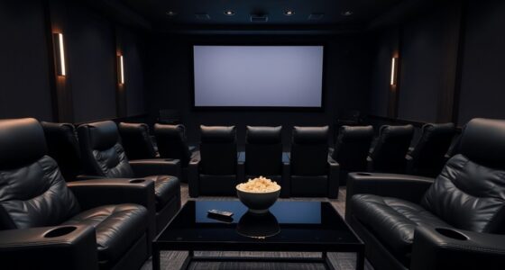
For a projector room, darker wall colors like charcoal or muted black typically deliver better image quality by reducing glare and reflections, especially if you have limited lighting control. Light walls such as white or pastels can wash out images unless you have dimmable lights and blackout options. To optimize your setup, choosing the right wall color and improving lighting control go hand-in-hand. If you’re curious about more tips, you’ll find useful insights ahead.
Key Takeaways
- Dark wall colors like gray or black enhance contrast and reduce glare, ideal for rooms with limited lighting control.
- Light wall colors can make a room feel spacious but may wash out projected images without proper lighting management.
- Effective room lighting control (blackout curtains, dimmable lights) is crucial when using light-colored walls for projection.
- Combining dark walls with controlled lighting optimizes image clarity and contrast in low-light environments.
- For well-lit rooms, light walls can work if paired with high-gain screens and excellent lighting control.
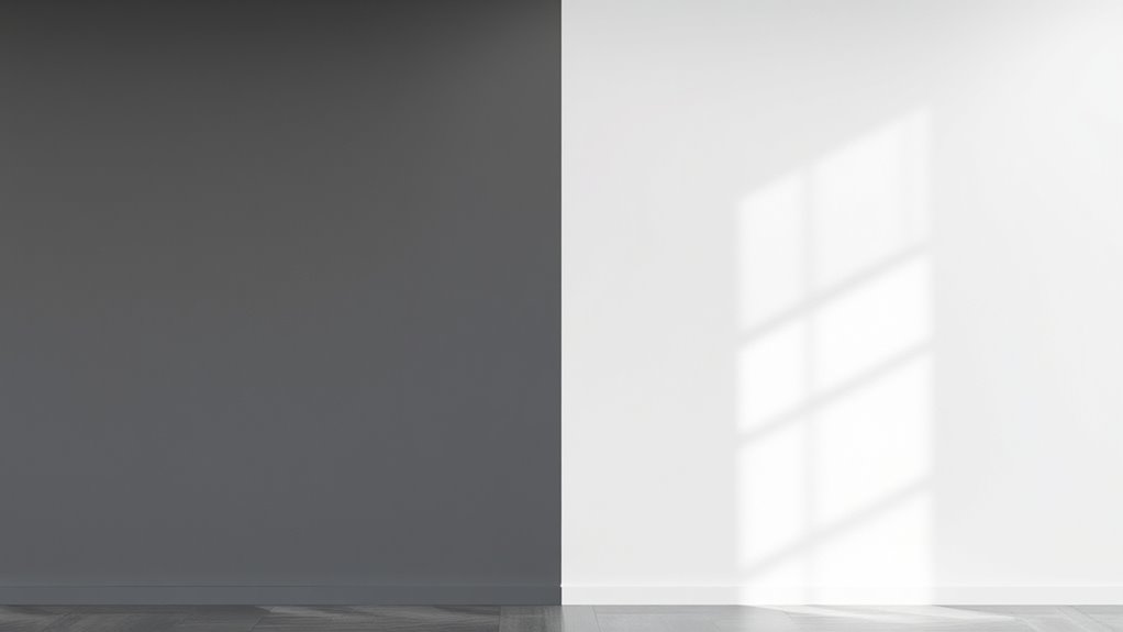
Choosing the right wall color can substantially enhance your projector room experience. When you’re setting up a space for movies, gaming, or presentations, the wall color plays a vital role in image quality and overall ambiance. Opting for the appropriate wall paint isn’t just about aesthetics; it influences how well your projector’s images appear, especially considering projector screen materials and room lighting control. Darker shades tend to absorb light and reduce glare, creating an environment where images pop with clarity and contrast. Conversely, lighter colors can sometimes wash out images, especially in rooms with uncontrolled lighting, but they offer a brighter, more open feel.
Selecting the right wall color boosts projector image quality and room ambiance.
If you’re leaning toward darker wall colors, think about shades like deep gray, charcoal, or muted blacks. These colors absorb ambient light, which means less light reflects off the walls and interferes with the projected image. This is particularly beneficial if your projector screen materials are designed to work best in low-light environments. A darker wall surface minimizes glare and enhances contrast, making images look more vibrant and sharper. It also helps in controlling room lighting; you’ll want to install blackout curtains or dimmable lights to prevent any stray light from bouncing around and diminishing contrast.
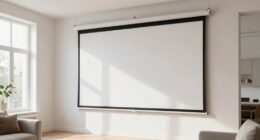
On the other hand, light-colored walls—whites, creams, or pastel shades—can make a room feel more spacious and inviting, but they come with caveats. If you don’t have effective room lighting control, like blackout blinds or dimmable fixtures, the light-colored walls can reflect ambient light, reducing the contrast and clarity of your projected images. This reflection can wash out details, especially when using projector screen materials that aren’t designed for high ambient light environments. To counter this, you might need to invest in high-gain projection screens or specialized paint that minimizes reflectivity.
The key is balancing wall color with your room’s lighting setup. If you prefer a lighter wall color, ensure you have excellent room lighting control to keep ambient light levels low during viewing. If you favor darker walls, you can afford to have more ambient lighting without sacrificing image quality. Additionally, considering room lighting control options can significantly improve your viewing experience. Ultimately, your choice of wall color should complement your projector screen materials and your room’s lighting control options. Properly controlling light and selecting suitable projector screen materials will ensure your chosen wall color enhances your viewing experience rather than detracts from it.

Official Licensed Google TV Smart Projector, HAPPRUN 4K UHD Home Theater with Dolby Sound, Wi-Fi & Bluetooth, Built-in Streaming Apps, Compatible with Games Consoles & Smartphone, Indoor & Outdoor Use
[ Built-in Official Licensed Google TV ] - Without additional equipment, the smart projector can directly access Netflix,...
As an affiliate, we earn on qualifying purchases.
Frequently Asked Questions
How Does Wall Color Affect Projector Brightness and Clarity?
Your wall color directly impacts projector brightness and clarity by affecting wall color contrast and ambient light absorption. Light-colored walls reflect more light, reducing contrast, while darker walls absorb ambient light, enhancing image sharpness. Choose a matte, dark hue to minimize glare and improve clarity, especially in rooms with ambient light. Opt for wall colors that effectively absorb excess light and boost contrast for the best viewing experience.
Can Wall Textures Influence Image Quality in a Projector Room?
Wall textures can act like a rough sea, disrupting your projector’s image clarity. You’ll find that textured walls or uneven paint finishes scatter light, causing shadows and blurring details. Smooth, matte surfaces are your allies—they reflect light evenly, ensuring sharpness and brightness. So, if you want a crystal-clear picture, stick to sleek textures and avoid bumpy or glossy paint finishes that turn your viewing experience into a visual storm.
Are There Wall Colors That Reduce Glare or Reflections?
You can reduce glare and reflection in your projector room by choosing matte or flat wall paints, which minimize reflection and glare reduction. Avoid glossy or shiny finishes, as these tend to cause unwanted reflections that can diminish image quality. Light, neutral colors like gray or beige also help diffuse light evenly, enhancing contrast and clarity. By selecting the right wall color and finish, you’ll improve your viewing experience markedly.
How Important Is Wall Color Consistency for Multiple Projector Setups?
Wall color harmony is vital for multiple projector setups because inconsistent colors can cause visual mismatches and distract viewers. You should choose paint finish choices that minimize glare and reflections, like matte or eggshell finishes, to guarantee uniformity. By maintaining consistent wall colors and finishes, you create a seamless viewing experience, preventing color discrepancies and enhancing overall image quality across all projectors in the room.
Do Specific Wall Colors Impact Sound Acoustics in a Projector Room?
Yes, wall colors can impact sound absorption in your projector room. Lighter, matte finishes tend to absorb more sound, reducing echoes, while darker, glossy paints reflect sound, possibly causing more noise. Consider color psychology too; soothing hues like blues or greens can enhance focus. Choosing the right wall color not only influences aesthetics but also improves acoustics, creating a better viewing experience.
![Projector-4K with WiFi and Bluetooth:[3500 ANSI/60W Dolby Audio/Official Licensed Apps], Outdoor-Projector with Smart OS 2.0 & AI Auto Focus,ONOAYO ONO5Pro 2.0 Smart Movie Projector for Indoor/Outdoor](https://m.media-amazon.com/images/I/41fylkjOTIL._SL500_.jpg)
Projector-4K with WiFi and Bluetooth:[3500 ANSI/60W Dolby Audio/Official Licensed Apps], Outdoor-Projector with Smart OS 2.0 & AI Auto Focus,ONOAYO ONO5Pro 2.0 Smart Movie Projector for Indoor/Outdoor
[Hear the Difference–Hollywood-Grade Dual 60W Dolby Audio] Why spend $500 on a TV + soundbar or settle for...
As an affiliate, we earn on qualifying purchases.
Conclusion
Choosing the right wall color transforms your projector room into a cinematic haven. Dark hues, like vintage navy or charcoal, absorb excess light and boost contrast, while light shades can make the space feel bigger but may wash out your image. Think of it as painting your own modern-day Coliseum—either darkened for an immersive experience or light for an airy vibe. Whichever you pick, make sure your walls set the perfect stage for unforgettable movie nights.

HAPPRUN 2500 ANSI Lumens Outdoor Projector with Built-in Streaming Apps, 4K Decoding Resolution, Dolby Audio, WiFi 6 and Bluetooth 5.2 for Indoor and Outdoor Home Theater
[ Built-in Streaming System ] – No extra equipment needed. This smart projector gives you direct access to...
As an affiliate, we earn on qualifying purchases.

ViewSonic PX749-4K UHD 4K Gaming Projector Designed for Xbox with 4.2ms Response Time, 4000 ANSI Lumens, H/V Keystone, 1.3x Optical Zoom, and USB C for Home Theater
4K Home Theater Projector: UHD (3840x2160p) 4K resolution with a 1.1-1.5 throw ratio and 4,000 ANSI lumens perfect...
As an affiliate, we earn on qualifying purchases.