To achieve accurate color, you need to choose the right color mode for your project. Use RGB for digital displays and CMYK for printing to make certain colors appear correctly across media. Adjust custom settings like color profiles and tone curves to match your output device, and always preview your work in different modes. Staying aware of these differences helps prevent surprises and keeps your colors true. Keep exploring these techniques to master consistent, vibrant results.
Key Takeaways
- Select the appropriate color mode (RGB for screens, CMYK for printing) to ensure accurate color reproduction.
- Match color profiles and bit depth in custom settings to maintain consistency across devices and media.
- Convert images to CMYK for print projects to align with printer specifications and prevent color shifts.
- Calibrate monitors and preview images in different color modes to anticipate final output appearance.
- Mastering color modes and settings allows precise control, reducing rework and ensuring visual fidelity across digital and print formats.

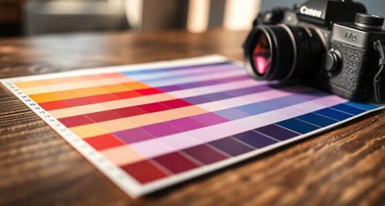
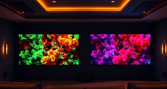
Understanding color modes and custom settings is essential for achieving the perfect visual results in your projects. When you’re working on digital images or print materials, knowing how different color modes impact your design can make all the difference. Color mode differences refer to the way colors are represented within a digital file—most notably, RGB, CMYK, and Lab modes. RGB, or Red, Green, Blue, is optimized for screens, offering a broad spectrum of vibrant colors. CMYK, which stands for Cyan, Magenta, Yellow, and Key (Black), is tailored for printing, ensuring your colors translate accurately onto physical media. Lab mode, on the other hand, is a device-independent color space used primarily for color correction and precise adjustments. Recognizing these differences helps you choose the appropriate mode for your project, whether it’s digital display or print, preventing color discrepancies that can compromise your work’s quality.
Once you understand the distinctions among color modes, you can proceed with custom setting adjustments to fine-tune your images. Custom settings allow you to control various parameters, such as color profiles, bit depth, and rendering intents, giving you more precision over how colors are rendered and interpreted. For example, adjusting your color profile to match your target output device assures consistency, especially when shifting between different screens or printers. You might find that switching from sRGB to Adobe RGB during editing grants you a wider color gamut, offering richer, more nuanced colors that enhance your design. Similarly, making custom adjustments to tone curves or saturation levels can help you achieve the exact look you want, whether you’re emphasizing vibrancy or maintaining subtle color nuances. Additionally, understanding color gamut differences can help you select the right color space for your project’s needs, ensuring your colors stay true across different media.
Applying these custom setting adjustments requires a clear understanding of your project’s final destination. If you’re preparing artwork for print, you’ll want to convert your color mode to CMYK and match your color profiles to your printer’s specifications. For digital use, sticking with RGB and making sure your monitor is calibrated properly guarantees that your colors will appear consistently across devices. Always preview your work in different color modes and monitor settings to see how your adjustments translate. This proactive approach helps you avoid surprises when your project reaches its final output, saving you time and maintaining your creative integrity. Ultimately, mastering color mode differences and thoughtfully making custom setting adjustments empower you to produce images that are true to your vision, regardless of the medium.
Frequently Asked Questions
How Do I Choose the Best Color Mode for My Project?
To choose the best color mode for your project, start with your project requirements. For digital work like websites or social media, select RGB because it’s optimized for screens. If you’re printing, switch to CMYK for accurate color reproduction on paper. Consider your target output and color accuracy needs. By matching your color mode selection to your project requirements, you guarantee vibrant, consistent results every time.
Can Custom Settings Improve Color Accuracy Across Different Devices?
Think of custom settings as your secret toolbox for color consistency. Yes, they can improve color accuracy across different devices by fine-tuning settings to match each screen’s unique personality. However, for true color consistency, you need to pair custom settings with proper device calibration. This way, you guarantee that your colors stay true, no matter where or how they’re viewed, like a master painter matching every hue perfectly.
Are There Industry Standards for Color Modes in Printing and Digital Media?
Yes, there are industry standards for color modes in printing and digital media, which help maintain color consistency. You should follow established color management practices like ICC profiles and adhere to standards such as sRGB for web and Adobe RGB for printing. These standards guarantee your colors remain accurate across devices and media. By applying industry standards, you can achieve reliable, predictable results in both digital and print workflows.
How Often Should I Calibrate My Display for Accurate Color?
You should calibrate your monitor at least once every two weeks to maintain accurate color and consistent results. Regular monitor calibration helps you achieve better color consistency, especially if you work with color-sensitive projects. Factors like ambient lighting and monitor usage can affect display performance, so more frequent calibration may be necessary if you notice color shifts. Consistent calibration guarantees your colors stay true across different devices and print outputs.
What Software Tools Support Advanced Color Mode and Custom Setting Adjustments?
Did you know that 70% of professionals say accurate color management is vital for their work? For advanced color mode and custom setting adjustments, tools like Adobe Photoshop, Lightroom, and Capture One support thorough color calibration and management. These software options allow you to fine-tune color profiles and settings, ensuring your display shows true-to-life colors, which is essential for photography, design, and printing.
Conclusion
By mastering color modes and custom settings, you open precise control over your designs, turning every project into a reflection of your vision. It’s almost a coincidence how the right choices seem to align perfectly when you pay close attention. When you understand these tools, you realize that achieving accurate color isn’t just about settings—it’s about trusting your instincts and embracing the subtle nuances that make your work truly stand out.